Golf Art and Landscape Paintings with Special Note of the
Paintings of Bethpage Black
by Samuel Ingwersen,
Watercolorist
The following comment regarding a painting, back then at the beginning of the 20th century, revealed an elevated status for golf paintings.
Andra Kirkaldy, of St. Andrews in his book, Fifty Years of
Golf, My Memories, commented about a scene that so moved him that he
said: “It would almost be worth a painting”. The meaning was clear. If a Scotsman would even consider spending money on a golf painting,
you knew that it had to be something dear to life and living, like a religion. Golf landscape painting, as a new art form, or genre,
was just getting started in England and Scotland in the early 1900’s as Andra was compiling his memories for his book.
The architect genius A.W. Tillinghast designed many fine golf courses; his Bethpage Black is exceptionally
great. Tilly considered great golf courses as those that possessed both qualities of challenge and beauty, not just one hole but a
diversity of strategic challenges and visual pleasures for all eighteen holes. Tilly in his essay,
The Course Beautiful, wrote: “he
who plans any hole for golf, should have two aims: first to produce something that will provide a true test of the game, and then
consider every conceivable way to make it as beautiful as possible.” Rees Jones has embraced Tilly’s ideas in his masterful
restoration of the Black. The most compelling affirmations that define this sense of greatness of the Black are the comments
that have been made by players of all stripes, writers, golf course architects, the witnesses to, analysts of and the best
players of the world who competed against the Black for the US Open title in 2002. Many of these people are quoted, in Philip
Young’s splendid book; Golf’s Finest Hour: The Open at Bethpage Black, who describe in many different ways, the greatness of
the Black, and why. If it had not been for the Melvillian “white whale” obsession of Tilly, to better Crump’s Pine Valley, the
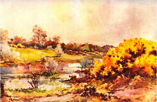
Black would never have become the great golf course that it is acclaimed to be. The memorable scenes of the Black are worth a
painting or two. Ingwersen offers 22 impressions, each with the ability to enhance, separate and extend reality; viz., provide
a kick, a dream, a memory; dear to the higher art of living.
Ingwersen’s paintings are done in the powerful medium of watercolor, a medium which continues
to gain in popularity and aesthetic appreciation. This article provides an insight to art appreciation. What are the criteria for
appreciation of art? Why are landscape paintings the most popular golf art form? Why is watercolor the preferred landscape painting
media? The artist hopes that the elaborations upon these questions will bring you lasting enjoyment of golf landscape art, especially
the impressions of A. W. Tillinghast’s vision, the Black, that he created, in every conceivable way, to be as beautiful as possible.
Rountree’s Watercolors
Woking
Deal
Prestwick - The Alps
One of the most sought-after books in the whole literature of golf,
The Golf Courses of The British Isles is an exceptional book with first rate depictions by Bernard Darwin, author and Harry Rountree, watercolorist.
The typical Rountree paintings, shown to the left, are delightful golf landscape paintings done in the watercolor medium. The earliest subjects of
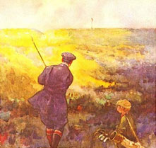
golf paintings were portraits of golfers and scenes peopled with golfers. Rountree, one of the earlier golf landscape artists, produced 64 golf
paintings for Darwin’s book, cited above, published in 1910 and republished by The Classics of Golf in 1988. Rountree’s depiction of skys was
influenced by John Constable, particularly Constable’s “English” great sky dramas, and JMW Turner and the “Romanticists.” Rountree enhanced
ordinary elements of the golf landscape with his dramatic skies (seldom blue). His depictions of the natural surroundings, expansive wastes,
cops, bunkers, sand, and grass (seldom green) were enhanced with his mix of contrasting colors. His seas, puddles and ponds were enhanced with
reflections and light sparkling upon their surfaces. Sometimes the focus was on the subject hole, often not. Take for example his “Out of Bounds”,
Sherringham, as the title implies; as you look upon it you are removed from the course where you see a golfer who is poking around the stones on
the beach, some 100 feet below a cliff and the fairway above, looking for his ball. Of the 64 originally published paintings by Rountree, only 3
have predominately blue sky and only 7 fairways are colored predominately green or yellow green. They are a kick, a delight, not once, but every
time you look at them.
Another golf landscape artist, Arthur Weaver did his work in the mid twentieth century. He was more a realist, and less the idealist, impressionist stylist
as was Rountree. His watercolor paintings employed a wide range of colors for all the surroundings. Grass may appear blue, when at noontime the grass
reflects the sky or appear gold when the sun is low in the sky. His paintings focus more upon elements on the ground, the sea, the fairways, bunkers,
greens and flagstaff while exploiting the qualities of light and transparency, with the unique qualities of watercolor. The average attention span for
viewing a painting by the typical gallery goers is 4 seconds; but time your self in front of a Weaver. As you stand there, you know you are looking at
a painting of a golf course, quickly you start to sense that you are experiencing one or the other of the pleasures in your life: the playing of golf
or the dreaming of playing golf in this setting. Gustave Flaubert, the French novelist, would roll around on the floor for two days, agonizing for the
choice of one word to complete a particular thought. With Weaver’s watercolors there is no hesitation in describing ones reaction, immediately, the
word is you are “taken”.
Ingwersen’s work is influenced by both Rountree and Weaver. Ingwersen often does a series of paintings of a golf course to capture the mood of the
course in different lighting conditions, of which there are myriad in nature, and impressions of the surrounding land and water. Sam ascribes to
Ruskin’s principal: “The landscape painter must create an image capable of producing in the distant mind of the spectator precisely that impression
which reality would have produced.” Sam creates his impression, at the edge of reality, which, by his understanding and his technique, the reality of
the image is enhanced by manipulating light and shadows to depict the image in light conditions, weather and moods that are there, but of which one may
witness such mix of conditions if they have the right season and the patience to stand for days. Examples of some of Ingwersen’s more colorful watercolors
are shown above which show the influence of Rowntree’s impressions of light and nature, and the influence of Weavers more precise focus upon the green
and of most importance, the object of the game; the flagstaff.
Painting may be traced back more than twenty thousand years dating to the polychrome images in the Lauscaux Cave. For centuries, the types of art were
predominately religious subjects. Other subjects, which began over lapping each in time, were royalty, the court, portraits, everyday life
(bawdy subjects in everyday life were suppressed by the Protestants), historicals, mythic, still life, and eventually a new subject; landscapes.
As a unique subject, landscapes, considered unclassical and secular, came into their own as a recognized force by the mid 17th and early 18th century.
The landscape became the focus itself, composing portraits, figures and other subjects in the background of the paintings.
Christopher Finch states in his book, Nineteenth Century Watercolors: “British landscape tradition prospered because its roots were firmly planted in
native attitudes and philosophies…By the early nineteenth century, thinkers like Anthony Ashley Cooper, Lord Shaftesbury, were elevating the worship of
nature to the point to where it came to be seen as a moral principal, so that Pantheism was virtually institutionalized. This attitude had a profound
effect upon landscape painting…” The movement gained in popularity with the great English landscape artists Thomas Girtin, John Constable, JMW Turner,
and others. Pantheism, as a religion, regarded God as the universe, manifest in all of nature. Constable was consumed by nature. According to
John Walker in his book, Constable, “Constable’s dedication to an analysis of vision…and his Pantheism, the very essence of his greatness, was just beginning to be understood”.
These artists produced landscape paintings many of which were rendered in the medium of watercolor. With the perfection of traditional and advanced
techniques artists successfully exploited the exceptional properties of watercolors. The watercolor medium, though more difficult than others, is
a powerful medium that continues to gain favor today. For the effects of light on form, for certain luminous qualities, for delicate gradations,
especially atmosphere and skies, watercolors had decided advantages over other media. The great watercolorists and the students that followed
brought freshness to their work. Detail was introduced into their paintings without diluting the overall breadth of the painting. Their
watercolors were uncluttered with fussy detail that was present in the Pre-Raphaelite style where images of every blade of grass, trees and
foliage were detailed to the point that a botanist could identify the species of every leaf and blossom of every tree and plant. Most important,
the watercolor technique let the viewers exercise their imagination; they would discover the illusion of existence, and the mood …more compelling
than if it had been real. The freer watercolor technique, absent of fussy detail, and compelling viewers to use their imagination, set the stage
for Impressionism that followed.
Constable’s Snow Device on No.1
Constable was fascinated by the ever changing moods of nature. The things that stayed the same on the ground were but backdrops to his romantic,
great sky dramas of wind, sunlight, and clouds full of action, color and moods. Constable’s “snow” was a device that artists used to achieve
realistic highlights on the foliage in their paintings. As an example of Constables methods to enhance light on the painting, Ingwersen has
used the snow device on the tree tops along the fairway of hole No.1 to depict the early light. Also, as Constable has done, of which comments
are made later in the text regarding his “savannafied” painting, titled Dedham Vail, Ingwersen has enhanced the light on the surface of the
green, not present in the original photo. Such realistic light patterns do exist in nature, thus it is logical, justifiable, and within reality
to paint in the shaft of sunlight at Round Swamp Road, behind the green, continuing across the green and into the fairway and beyond, the object
being to emphasize the element of the golf green in its place in the overall composition of the painting.
Lord Shaftesbury and his followers elevated the worship of nature in artisan’s crafts, garden design, and landscape architecture.
The words nature, natural, natural beauty began to appear in the literature in reference to golf course construction at the start
of the 20th century as Willie Park, Jr. was beginning to revolutionize golf course design with his adaptations of natural features
of the land. Where not blessed with scenic features of the seaside, he exploited the natural features of giant whims, chasms, wastes
of trees, heather, swamps and native grasses where he constructed his golf courses on less desirable land. What nature suggested, Willie
Park, Jr. wrought into grand visions. Passions in the 20th century brought an explosion of playing golf
among the multitudes. The “feathery” ball had cost a half crown, which cost the working man three days wages, and was ruined with one skulled shot.
The Gutty and later, the Bounding Billy ball now cost him but an hour’s wages, which made golf more affordable. Similarly as nature
and the worship of nature inspired artisans, the passion for golf demanded pictures and ornamentations from artisans to depict upon
the surfaces of all manner of utilitarian objects, from ale tankards to hat pins and canvass; artistic golf images. It was only a
short time until the combination of the natural elements of sky, atmosphere, water and land with the assistance of ingenious designers
using earth scrapers, saws and manure to alter the land, offered up of beautiful visions and an appreciation for these visions that
were depicted in landscape
paintings.
Roger Caillois, the French sociologist, puts forth an intriguing concept relative to the appreciation of art. Creating art and viewing art are
forms of recreation, just as much in playing music and listening, and as in literature; the writing and the reading of literature are forms of
recreation. The ingesting of chemicals is also a (albeit unnatural) form of recreation. Caillois, in his book, Man, Play and Games, states
that: “Recreation is simulation, with the abilities to alter reality; by heightening reality, by separating reality and by extending reality.”
One who is involved in recreations may get an altered sense of reality such as: 1) a heightened sense of reality or a high; 2) a separate sense
of reality, a dramatization, or where your imagination discovers more than is presented, or your mind indulges for a moment with a thought of
what might be, or become caught up in the “flow” of the event, (while in the “flow”, who ever thinks about the troubles of the world?); or 3)
an extended sense of reality such as a remembrance afterwards, sometimes beautiful, sometimes otherwise, mostly pleasurable.
In his recent interview, Paul Newport, for the Wall Street Journal, reported in his article,
How to Paint a Course in Light, this sense of altered reality, as expressed by Larry Lambrecht and Joann Dorst, professional golf photographers.
The photographer’s objective was to compose images with drama and emotional impact. (In Caillois words; to heighten reality). Both photographers
explained to Paul what they were after in almost identical language: “to transport viewers to that place and that hole and make them want to
play it.” Also, Paul emotes over Lambrecht’s photograph of Royal County Down, that: “The image evokes not just the whimsy of nature but also
the elemental thrill of playing golf on the Irish links.” (In Caillois words; to experience a separate reality). Another form of a sense of
altered reality is given by Buddy Hackett in his book, The Truth About Golf and Other Lies, who experienced a sense of extended reality by
his comment: “…I dedicate this book to 1957 when I hit a good shot and to 1963 when I did it again. Those were two wonderful years.”
When we get these kinds of experiences; a kick, or a peek of what we might be, or a wonderful remembrance; we ought to capture the moment,
put a frame around the image, and hang it on the wall so that we may enjoy every look, and enhance every day, for life. This proposition,
art to enhance every day, offers a practical explanation of the purpose of art, if not, then, what is the purpose of art? Answering this
question, about the purpose of art, H. van Loon presents the answer in his book,
The Arts: “… the purpose of all arts should have one single purpose and should contribute as much as is in their power to do so to the
highest of all arts: the art of living.” Thus, art may enhance life. Once one tends to agree with this statement of the purpose of art,
the criteria for appreciating art should become evident. What is the basis for the appreciation of art? Caillois’ observations of simulation
and recreation and their ability to alter reality may be applied to a set of practical criteria for art appreciation. The criteria
are: 1) Does it give you a kick, a high? 2) Does it stimulate your imagination? And 3) Does it produce a pleasurable remembrance?
Score high on any criteria and you probably already own the painting. This insight has universal application inasmuch that it may be
readily applied to all art, whether it is golf art, or the detailed realism art of the Pre-Raphaelites, or the Renaissance masters, or
abstract art. How would you deal with the following, not unusual, dilemmas A or B? 1) Do you argue your position on the purpose of art,
2) let public opinion prevail, or 3) do you become imaginative as to where your choices for art might be displayed?
A) No golf art in the living or dining room! You had a good year and put $50,000 in an account for your wife to redecorate the
downstairs. She had some anxiety about the a’vant color scheme of blues and greens and the statement it made about her taste to her
friends. She also had some anxiety about letting you hang a golf landscape painting in the living room or dining room, even though the
painting was the right size for that wall in the corner, and had the right colors. Finally, she and her decorator inveighed arty principals of
interior decorating, safe from suspicion of poor taste. They convinced you, instead of any golf painting, that the landscape with peasants
pitching hay onto a hay wagon should hang in the living room and the picture of apples and grapes hang in the dining room.
B) No golf art on the first floor! This dilemma involved a golfer who has an extensive golf art collection. Some of his pieces were
landscapes that were stunning, delightful scenes. The edict however was: no golf art on the first floor. So, as a husband, knowing the
benefits of an agreement, and as an attorney, knowing the loop holes in any agreement; he proceeded to hang the initial piece above the first
step of the staircase and up and up until there were 38 pieces hanging in the stairway.
Intellectual questions about purpose and appreciation of art, or your “taste” in art will never rattle you should you embrace the logic set
forth above regarding the purpose of art and criteria for judging art. Russell Lynes gives us a look at the forces that shape our tastes in
his book: The Tastemakers, The Shaping of American Popular Taste: “Taste is our personal delight, our private dilemma, and our pubic façade. The mere
matter of how we decorate our homes is only a minor part of the concern. There are pressures on our tastes from all sides…the purveying of
taste in America has become big business employing hundreds of thousands of people in editorial and advertising offices, in printing plants,
in galleries and museums, in shops and consulting offices…It is in the nature of our economic system not merely to meet demand but to create
it. One of the ways that demand is created is by changing people’s tastes, or at least inviting them to change and by making the pressures
to give up what seemed good yesterday for what should seem inviting today…” You will someday see more golf landscapes in the permanent
collections of art museums. What? Yes, consider what The River Tree Center for the Arts Irving Gallery of Kennebunk/ Kennebunkport,
Maine has done to advance the appreciation for golf art. The gallery put on a first rate exhibit entirely of golf art. The gallery
is not a golf related business; it is a public gallery. It is one of the foremost galleries to make a total commitment to such a
relatively new type of art. No doubt the decision was made, but not without some doubts of blowing the gallery’s entire season,
to exhibit golf art rather than more popular types of art such as seascapes, sailboats, costal townscapes, and quiet estuaries
indigenous to this popular New England resort area. The exhibit opened in July and concluded September 2007. Receipts were counted.
The Golf Art Exhibit sales were five times as much as any other prior exhibit. The number of golf landscapes in watercolor media
outsold all other forms of art. The curator, Gary Koch, got the curatorial choices and their colors right, plus some green for the
artists. Many landscape paintings are in permanent collections of museums. This new genre, golf landscapes, with myriad features of
nature in all its glory wrought together in creations made by man, and idealized by depictions of artists, is gaining devotees.
Hearken, the Louvre, the Metropolitan, and the Tait to the hum of ticket machines and the eloquence of cash. Patrons will travel
miles for a kick that may be found in such beautiful depictions of air, land and water.
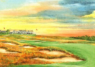
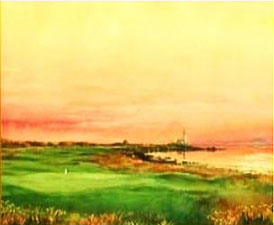
Bethpage Black No. 11
Gullaine #1 Course No. 8
The skies, in the paintings above, by Ingwersen are not unlike Constable or JMW Turner skys that depict a threatening atmosphere. A lens of light,
not necessarily light rays as shown here, illuminates the surfaces of the greens in all of Sam’s paintings. The Black No. 11 is intended to be a
whimsical impression of “Tilly the Terror” guarding his bunker with a menacing gaze, thru a parting of the clouds, upon the transgressor who is
doing his time in his bunker. Tilly, also befitting the Terror, is wearing his pointed mustache, described by Herb Graffis: “a mustache that could
spike incoming and outgoing mail”. Some St Andrews bunkers have names. No names are necessary on the Black. They are all brutes. The sky that is
depicted in the painting of No. 8 Gullaine is typical of the quickly changing, forceful, natural, and real skies over golf courses in Scotland that
are located close by the sea. Many of the skies of inland golf courses in Ingwersen’s watercolors are monotones in blue or bright colored hues
caused by a low sun. Skys suggest the mood, but where quiet, the elements on the ground draw more
attention.
Other art expert’s points
of view are instructive. Andre Malraux states in words to this effect in his
book, The Voices of Silence: “…the purpose of art is not something to
put a frame around and hang on the wall and ascribe immortality to it two
centuries later, but the purpose of art is the thrill in creating it and
that once complete, the thrill has gone out of it…” Mostly so, but not
entirely. Many persons experience a thrill in looking at art, evidenced by
millions of people who travel great distances to visit the great museums of
the world to view “immortal” art. The critical elements of a) color, b)
tone, c) form, d) line, e) light, f) composition and g) technique with the
medium that is used have performance standards that are rigidly applied
before the art is even considered by the serious collector or museum
curator. Excellence of these critical elements, as well as other criteria
such as historical significance, possession status, collector obsession, the
artist, the tax consequences and the rarity of type are relative to the
appreciation and the movement of art in the marketplace.
Dedham Vale by John Constable 1828
The treatises by art critics and
aesthetes have made much of the theories of art and art appreciation.
Volumes and volumes have been written. But alas, they all come back around
to the simple notion that the personal appeal of art has something to do
with gut feelings, a kick, no little stirring of imagination, or a memory;
completely defined by Caillois’ terms as the ability, to heighten, separate
and extend reality.
Both Rountree and Weaver were the early
landscape painters of golf as known today. There were others, however both
are the most sought after of this relatively new art form.
Landscape paintings will continue to be
the preferred art subjects for the foreseeable future. This is bourn out not
only by the popularity of landscape paintings but by the theories of
researchers and the findings of their recent research projects, which are
cited below.
Richard Conniff author of
The Natural
History of Art, maintains that a sense of what is beautiful is embedded
in our genes. It is instinctive. Man has survived because of his consistent
choice, preservation and appreciation of elements necessary to his habitat.
Conniff’s research is supported by Gordon Orians’ research at the University
of Washington, who maintains that there is a natural history of
aesthetics. Humans like animals select habitat according to specific
criteria, such as the presence of water, large trees, open space and distant
views. Orians asked test subjects to rate landscape paintings. They tended
to prefer the paintings with criteria evoking the savanna where humans
evolved.
A John Constable landscape like Dedham Vale
1828, to the right, appeals to us, Orians argues, because it gives the
viewer cues to finding resources and avoiding danger. Orians and co-author
Heerwagan found that when they compared sketches that Constable made on the
spot with the finished paintings he produced later in his studio they found
that the artist consistently “savannafied” reality that enhanced desirable
cues. Constable’s “savannafied “ painting has improved the delineation of
and increased amounts of the grasses and foliage in the foreground and the
valley below, and added much richer hues of yellows, tans, golds and rusts
than had been present in a lesser degree in his earlier painting and sketches
of Dedham Vale. Constable in this painting also uses the Claudian device (illustrated below)
of dark shadows and shades framing the foreground in the front and at the side, a device
that is as effective as perspective and that has been used by artists repeatedly over the centuries.
Photo of Suggested Color Key No. 8 Black
Photo of Suggested Composition No. 8 Black
Ingwersen employs the same “savannified” enhancements (fescue and native grasses better defined
with light and color in areas where it is originally suggested) that Constable applied to his
paintings. Sam illustrates this “savannafied concept using the actual views taken by a camera
of No. 8 of the Black, above, and then compared to the finished paintings shown below. The colors
may appear enhanced in the final painting example, but they are there in all their brilliance in
reality, more so when back lighted. The colors used in the final paintings of No. 8 are suggested
by the Photo of Suggested Color Key, however, the moment the picture was taken the colors were
not as brilliant as one sometime sees them. Instead of waiting until the sun illuminates the
brilliant colors of all of the elements simultaneously and waiting until all defining shadows
are in place; as photographers will tell you that they may wait days to capture on film; Ingwersen
merely brushes a little more pigment or a little more water onto the elements of the painting to
match the color key. The Photo of Suggested Composition was used for the composition or arrangement
of the natural and man made elements in the final painting, as shown from the tee.
Final Paintings No. 8 Black by Samuel Ingwersen. Views from behind
the green and from the tee
France Most Wanted Painting c. 1996
Two
significant research projects in the mid 1990s were conducted by artists Vitaly
Koran and Alex Malamid, Russian émigrés. Their research queried people in each
of 14 countries to determine their aesthetic preferences in paintings. They
submitted digital images over the web in response to questionnaires that defined
in words those images most and least wanted. The artists then digitized the
paintings and got back confirmation of the paintings in a final response. The
research was supported by the National Institute and the Chase Manhattan Bank.
The favorite colors were blue. The second choice was green. The favorite “Most
Wanted Paintings” were landscapes in 12 of 14 different countries polled. The
France Most Wanted Painting, shown right, is typical of the most wanted
paintings of 12 countries, which included United States, China and Russia. The
subject and the composition or arrangement of the elements that made up the
paintings was similar. In every instance the view was a long vista painted from
an elevated position. The fore and the middle grounds consisted of three basic
elements: 1) a prominent tree with shrubs or smaller trees nearby, 2) people
singularly or in small groups involved in some activity, or a hero, or religious
person, and 3) small groups of animals, some with agricultural products or
structures in the middle ground. The back- ground was consistently a blue sky,
wooded hills and water.
Claudian Device
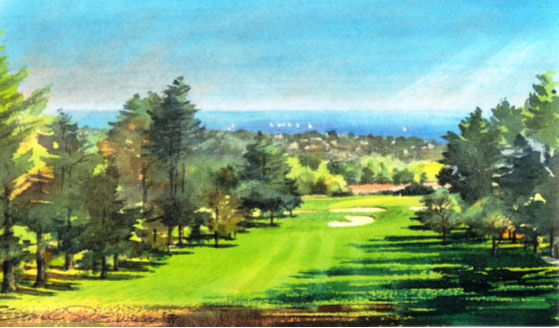
Substitute a golf green and flagstaff in any
“Most Wanted Painting” of the 12 countries and you have a view not unlike a view
you wouldhave from an elevated teeon a present day golf
course, much like the paintings of Ingwersen’s Pasatiempo, or the Jue de Mail by
the Flemish painter Bril. These paintings, as well as Constable’s work and much
of Ingwersen’s work use variations of theClaudian device, formalized by
Claude, but first appearing in Bril’s work. By the mid 17th century
landscapes began to be considered as worthy subjects, previously lacking
moral seriousness, not acceptable to the church, which favored mythic or religious subjects. Bril was considered an
idealist landscape artist, whose style had a profound influence upon Claude, who
in turn influenced Constable. John Constable considered Claude Lorraine as “the
most perfect landscape painter the world ever saw”. The Claudian device is a
dark element that extends up and across most of the foreground and which
consists of shade and shadows. The purpose is to achieve contrasts, control the
focus and impart greater depth to the painting. Variations may also be the
reverse, a light foreground against a dark middle ground, as in the France Most
Wanted Painting. Colors show through and are mixed with the dark tones to give
interest to
Jue de Mail a la Chicane by Paul Bril 1624
what otherwise would be dark lifeless voids. These research
projects, and the evolution of landscape painting, with landscapes moving from
an unfavored, lesser status to an elevated status, and the comparable trend of
thisrelatively new genre, golf landscape painting, reveals an insight
ofthe future of golf art; its subjects
and media. Museums that are not golf museums are staging special exhibits of
golf art. The United States Golf Association now commissions an annual landscape
painting to officially commemorate the most celebrated golf tournament in the
country. As to golf art, the landscape will be the primary subject with
portraits and figures relegated to minor status in the overall composition of
the paintings. As galleries and individuals collect golf art, choices will be
made of images that are done in the medium that is the most dramatic and vividly
expressive.
Pasatiempo Course by Samuel Ingwersen 1991
The three most used media; transparent, opaque and photographic media all
have the capabilities to produce excellent images of market quality. Each medium
has its shortcomings. The need to often reposition elements in the image’s
compositionappearance is a problem for photographers, but poses
no problem for painters who are able to lie more easily. An important
consideration is paint light fastness, or the ability of a pigment to retain its
original color under exposure to light. Light fastness of watercolor paints on
archival papers today are more durable than any oil painting on canvass. If you
were to examine landscape images side by side of the same subject done in each
of the different media, their differences in the representation of the one most
important quality to each, quality of light, would easily become apparent.
Watercolor media is favored for the effects of light on form, for certain
luminous qualities, for delicate gradations, especially atmosphere and skies to
best express impressions of nature in all its moods, subtleness and light
effects. Watercolor allows no reworking of pigments to the extent that other
media permits; otherwise a watercolor turns to mud, but, exploit watercolors
exclusive qualities and you get success. Although numbers of paintings sold is
no measure of excellence, it is significant to acknowledge that golf landscape
print sales of watercolors vs. sales of oils at two different sites of US Open
courses, exclusive of catalogue sales, resulted in sales approximately one
hundred watercolor prints to one oil print..
Apollo and Mercury by Claude 1645
Oil and acrylics are opaque media. The definition of opaque is dark, thus
opaque media is inherently darker than transparent media. Oil paintings are
capable of delightful effects, but compare a successful watercolor of the same
subject and you will see a work of more vibrant light. Opaque media allow
pigments to be overlaid with pigments. This seeming advantage is often the
medium’s fatal flaw; overworking a painting as the pigments permit and you will
get a stiff appearing, lifeless, dark work, more suited to a draughtsman, than
an artist.
Photography can be successful for those with patience and who steadily
work at it. A comment attributed to Ansel Adams is that you may possibly get 10
good shots a year. Technical advancements in photography allow digitizing
enhancements in the studio, which most photographers do, but tinker too much
with the photograph or attempt to recompose significant elements of the scene
and it comes out a fake. Newport in his WSJ article on golf course photography
quotes photographer Lambrecht: “When someone changes out a sky, you can tell in
an instant. It looks fake because it’s not what the eye would ever see”. The
moral here, for all landscape artists is: Depart too far from nature and your
work is a lie; lending creditability to Picasso’s definition: “Art is a lie”.
Bril was
called, as the term was used then, an idealist landscape painter; he enhanced
his landscapes. The title of Bril’s painting “Mail a la Chicane”, translated:
mallet and an obstacle. There is no architect’s tyranny; nature is adequate
here, although the bunker could use a little aesthetic trimming. The painting
has the Claudian device, but most significant, the subject shows a major shift
away from the favored, serious moral, religious, and mythic subjects that the
church and noblemen were buying of that era. What an irony, the subject may not
have been a moral theme of that era, but apparently was a subject serious enough
that it was worth a painting that would providepleasurable memories to a
nobleman of his favorite game. Four centuries later, tastes appear to be running
the same, for the serious subject of golf has become a near religion, with
assorted paintings to heighten its being.
Claude’s landscape, Apollo and Mercury
illustrates his device of contrasting elements in the foreground. Claude’s
style of landscape painting has become an enduring force, powerful enough to
influence choices of “The Most Wanted Painting” of the world. Figures were
not favored by Claude, the true subjects being the land, sea or air. He told
his patrons that he sold them the landscape; the figures were gratis.
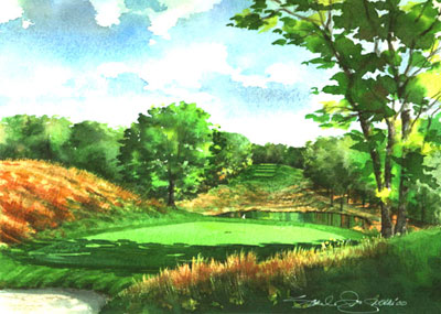
Black No. 4 by Samuel Ingwersen2000Black
No. 17 by Samuel Ingwersen 2008
Exceptional landscape paintings involve two
geniuses; nature and an artist. Exceptional golf landscape paintings benefit
from a third; a sculptor landscape architect of sorts, whose genius has
imparted beauty to the scene and the play. Tilly’s No.4 and No.17 are
exceptional creations of his Black course, and as refined by Rees Jones. The
bunkering dominates these scenes, in reality and in the artist’s paintings;
and gets your attention; first for the sight of it, second, for its
challenge as a golf hole, never the other way around. Rip out your brains
and let your eyes see, said Picasso. Look at these scenes and what do you
see? Bunkers. Not busy, panoramic landscapes of elements competing for your
attention, but bunkers from one end to the other, framed in white so that
there is no diluted focus. The No.4 center set of bunkers is built into a
hillside which makes them visibly more prominent than if built on flat
ground where the view of them would be foreshortened. The bunkers are not
ordinary, they are a huge, dominate presence; their essence is the stunning,
rhythmic, repeating pattern of the sculps, all similar in form, repeated in
each group. No.17 has a similar bunker pattern. The bunkers compel your
attention. The theme is a strong repetition of unbroken curves. The actual
view from No.17 tee reveals the bunker lines as broken, distracting from the
aesthetics. The view point of No.17 painting is closer to the green where
the surface of the green may be seen, but more importantly the lines of the
bunkers are depicted as continuous, unbroken, rhythmic curved sculpts. The
artist proclaims the Black No.4, unaided by dramatic, scenic elements, but
possessed of bold, simple, functional shapes, to be the greatest golf hole.
The artist has enhanced the real view by making slight, but exacting changes
in composition, color, and shadows with understated sky, grasses and
woodlands. The understated elements, are simply painted monotone passages of
pigment that enhance the dominate element, the bunkers, by their contrast.
Tilly was impressed with the vast sand of the Scottish links upon seeing
them prior to becoming an architect. These sand dunes, influenced his style,
but never became a cult. Tilly spoke often of his passion for vast bunkers.
His friend replied: You’ll find enough for a thousand courses out toward
Montauk Point.